Existing behaviour helped focus the questions worth investigating.
Firefish · Pre-AI product design
Designing a clearer path to a Bitcoin-backed loan.
Firefish is a peer-to-peer lending platform where people borrow from other people, with Bitcoin used as collateral. I shaped the borrowing experience from early evidence to tested UI—and stayed involved through implementation to protect its quality.
01 / The challenge
A financial decision with too many invisible consequences.
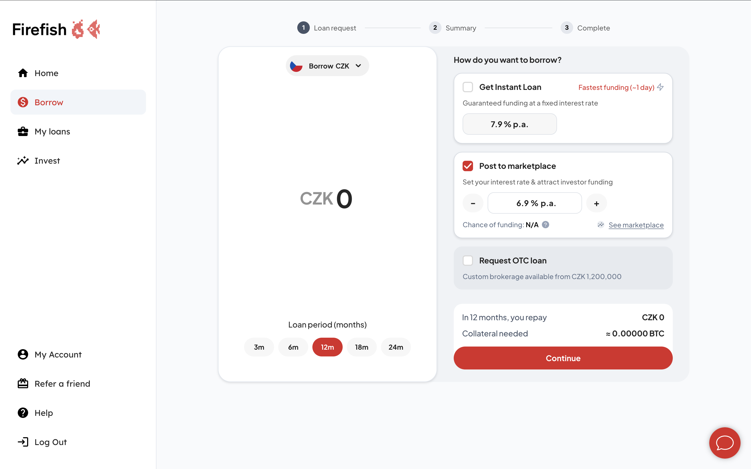
Borrowing against Bitcoin asks users to make several connected decisions at once: currency, amount, term, interest rate, funding method and collateral. Each choice changes what happens next.
The experience had to make those dependencies understandable without turning the product into a financial manual. It also had to support three different paths—an instant loan, the peer-to-peer marketplace and a bespoke OTC request—inside one coherent flow.
The interface needed to reduce uncertainty without hiding the mechanics of the loan.
02 / Discovery
Start with evidence. Then decide what deserves to be designed.
We began with hypotheses, not answers. I combined internal product analytics with interviews conducted at conferences, where we could speak directly with people already familiar with Bitcoin, borrowing and investing.
The research helped separate genuine decision friction from internal assumptions. It gave us a clearer view of the questions users needed answered before they could confidently continue.
Conversations at conferences added motivation, language and context.
Assumptions became explicit enough to challenge through prototypes.
03 / Shaping the experience
Turn complexity into a sequence of confident decisions.
01Research
02Define
03Concepts
04Prototype
05Test
06UI & copy
07Handoff
Compare funding paths in context.
Users can weigh speed, interest and flexibility without leaving the loan request.
Keep the core variables together.
Amount, currency, term and rate remain visible as parts of one decision—not isolated screens.
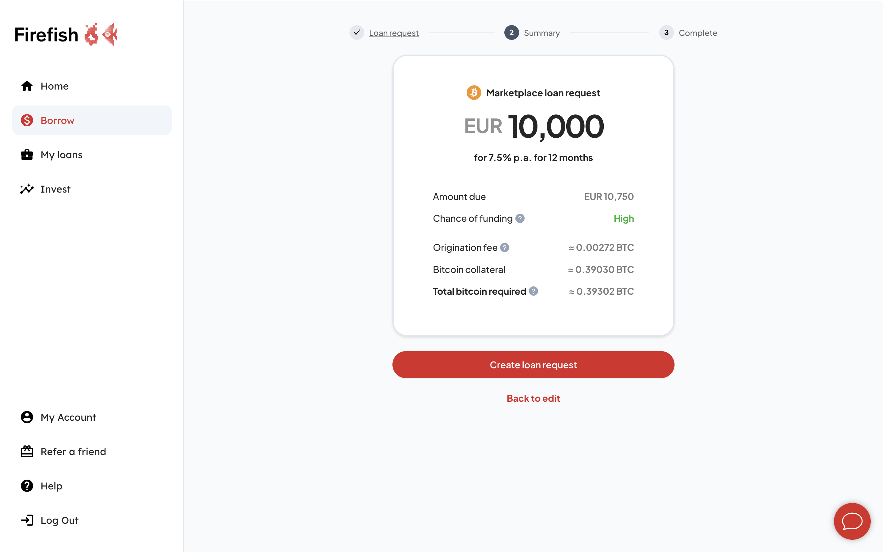
Make the commitment explicit.
The summary clarifies repayment, fees, funding probability and required Bitcoin before submission.
04 / Validation & delivery
The design was ready. The value still had to travel.
We tested the prototypes, refined the final UI and tuned the copy as part of the experience. The result was then handed to engineering for implementation.
I reviewed the frontend, identified gaps between intent and execution and worked with the developers to preserve the designed quality. The redesigned experience reached production four months after handoff.
Design readyFeedback · QA · rework · waiting4 monthsValue in production
05 / Outcome & reflection
A complete production experience—and a clearer view of the bottleneck.
The redesigned borrowing flow is live. It carries users from configuring a loan through choosing a funding route to understanding and confirming the Bitcoin collateral required.
The work also exposed a structural limitation: design quality could be ready while customer value remained months away. The gap was not in product thinking. It was in fragmented ownership of delivery.
A design outcome only becomes real when a customer can use it.